Banksy recently updated his website with a number of new works that have been making the rounds the last day or so. My favorite new artwork is this simple piece depicting a spray-painted ballerina delicately traversing the string on the back of a picture frame like a tight rope.
29 may 2012
28 may 2012
INCONGRUOUS ELEMENTS
Etiquetas:
architecture,
Dean Monogenis,
drawing,
New York,
paper
21 may 2012
Regards from Barcelona
The Association of Photographers' Student Awards have been announced with Jordi Ruiz Cirera from London College of Communications named as the 2012 Student Photographer of the Year
Ruiz Cirera's series of portraits of members of the Mennonite communities in Eastern Bolivia won him the top prize. The Mennonites emigrated to Bolivia in the 50s hoping to be able to preserve their traditional lifestyle away from the trappings of the 20th century. "This series of portraits intends to showcase the relations and the family roles within the Mennonite community, as well as their deep isolation from contemporary society," says Ruiz Cirera.
Ruiz Cirera originally hails from Barcelona but graduated from the MA in Photojournalism and Documentary Photography at LCC last year. He spent a year working on the Mennonite project, a second series from which (one shown below) won him a Merit at the AOP Student Awards.
Etiquetas:
AOP Student Awards,
Association of Photographers' Student Awards,
Barcelona,
Bolivia,
Jordi Ruiz Cirera,
London,
Photojournalism,
The Mennonites
18 may 2012
Simone
Peter Mendelsund isn't generally known as a designer who makes garish book covers. But in his recent designs for three late works by Simone de Beauvoir, he's done exactly that. And for good reason...
His covers for de Beauvoir's memoirs Adieux and A Very Easy Death, and the novella collection The Woman Destroyed apparently reference the look of the handmade protest posters seen on the streets of Paris in 1968.
Bringing the look up to date, the lettering has the quality of freshly daubed marker pen, while the illustrations are in bright blocky colours – the messy imagery on The Woman Destroyed reminiscent of an early MS Paint application.
"I wanted a style that had a certain directness – and I liked the idea of co-opting the visual language of revolution for a writer who was nothing if not (philosophically, politically) revolutionary," writes Mendelsund on his blog Jacket Mechanical. "Also the style is more or less temporally and geographically correct. The simplicity of the style made it possible for me, with my limited skills, to make them myself."
This is an unusual direction for Mendelsund who, as an associate art director at Knopf in the US, has a reputation for producing some quite beautiful and elegant book covers for writers such as Michel Foucault, Roberto Calasso and Franz Kafka (whose entire works he recovered in 2010 – we reported on the series, here).
On his blog, Mendelsund writes that his work for the de Beauvoir project sought to be both brash and attractive at the same time. "I've certainly made ugly covers before; and I hope that I've made pretty ones," he writes. "But it's the coexistence of both attributes that makes me happy here."
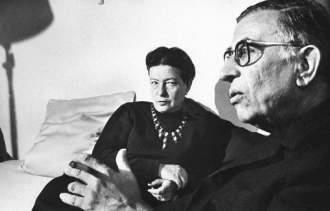
Mendelsund also prefaces his explanation of the cover direction with a smart essay on the relationship between de Beauvoir and Jean-Paul Satre, using a single photograph of the couple as his starting point.
Etiquetas:
cover,
design,
Jean-Paul Sartre,
Peter Mendelsund,
Simone de Beauvoir
16 may 2012
Looking for...
12 may 2012
For $250 million....
Qatar Purchases Cézanne’s The Card Playersfor More Than $250 Million, Highest Price Ever for a Work of Art
With this landmark score, the tiny, oil-rich nation joins a massively exclusive club: only five Card Players exist, and the other four are in world-class collections such as the Musée d’Orsay and the Metropolitan Museum of Art. The purchase is just the latest bid in Qatar’s effort to become an international intellectual hub.
What would you do with $250 million?
1 Cezanne
10 decent sized mansions in the Hamptons
100 upper-middle class family homes in Beijing
1000 Ferrari 458 Italia Coupes in Rome
10,000 Ducati 1199S motorcycles in Paris
100,000 complete high school educations including accommodation,
food and healthcare in Lhasa, Tibet
5,000,000 milking goats in Dar es Salaam, Tanzania
50,000,000 egg-laying chickens in Dhaka, Bangladesh
6 may 2012
iconografia religiosa (adaptada)
5 may 2012
4 may 2012
BAUHAUS, ART AS LIFE
A Practice for Everyday Life (APFEL) has worked with architectural studio Carmody Groarke on the exhibition design for Bauhaus: Art as Life which opened at the Barbican Art Gallery this week in London...
The show contains over 400 works from the most prestigious and extensive Bauhaus collections in the world and looks to provide and in-depth exploration of the school's 14 year history, focusing on the lives of its students and staff and the community they created.
Together Carmody Groarke and APFEL have, they say, designed "an architectural installation of elemental forms that both compliments and enhances the exhibition's contents." As a result, the Barbican Art Gallery has been physically rearranged to create a bespoke viewing experience for its visitors.
Graphically, the show's design has been informed by Bauhaus principles of colour, structure and typography, with brightly coloured walls, bold panels and super graphics conspiring to draw together exhibits, themes and ideas. The typeface used throughout the exhibition, FF Bau by Erik Spiekermann, is a contemporary revival of Breite Grotesk, a letterpress face largely used within the Bauhaus itself.
"Designing an exhibition about the Bauhaus is every graphic designer's dream, but it's also a daunting challenge," APFEL's Kirsty Carter told us of the project. "It already holds such a vivid visual presence in the public consciousness, and this makes it very difficult to design for a Bauhaus exhibition and create something that feels original," she continues. "Our approach was to start with a really intensive research project, looking into all aspects of the Bauhaus and its rules, and then reinterpreting them in an exhibition context - aiming for a design that felt true to the spirit of the school without resorting to pastiche or parody.
"We have looked to the Bauhaus' wall painting workshops in choosing the exhibition colour scheme, studied its principles of typography when designing titles, labels and captions, and taken cues from its exhibition design work when designing the structure of the show itself. The Bauhaus: Art as Life exhibition is as much about celebrating the Bauhaus's occupants and their community as it is the iconic works they created, and we have tried to provide a similar sense of human context and character through the exhibition design."
Etiquetas:
APFEL,
art,
Barbican Art Gallery,
bauhaus,
design,
exhibition,
life,
painting
3 may 2012
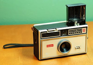
GOODBYE KODAK
Etiquetas:
cámaras,
carretes,
carteles,
films,
fotografía,
KODAK,
photograhy,
vintage
2 may 2012
American Gothic
Julie Blackmon
Blackmon's photographs are inspired by her experience of growing up in a large family, her current role as both mother and photographer , and the timelessness of family dynamics.
Etiquetas:
American Gothic,
family,
Julie Blackmon,
photograhy
Suscribirse a:
Comentarios (Atom)


