Mostrando entradas con la etiqueta design. Mostrar todas las entradas
3 abr 2016
17 ago 2015
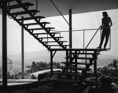
Lina Bo Bardi
— I never wanted to be young.
What I wanted was to have a History
In 1951 Bo Bardi designed the "Casa de Vidro" (“Glass House”) to live with her husband
Drawings
After the Flood
http://www.harvarddesignmagazine.org/issues/16/after-the-flood
Etiquetas:
architecture,
Brasil,
design,
italy,
Lina Bo Bardi,
Sao Paulo
18 may 2012
Simone
Peter Mendelsund isn't generally known as a designer who makes garish book covers. But in his recent designs for three late works by Simone de Beauvoir, he's done exactly that. And for good reason...
His covers for de Beauvoir's memoirs Adieux and A Very Easy Death, and the novella collection The Woman Destroyed apparently reference the look of the handmade protest posters seen on the streets of Paris in 1968.
Bringing the look up to date, the lettering has the quality of freshly daubed marker pen, while the illustrations are in bright blocky colours – the messy imagery on The Woman Destroyed reminiscent of an early MS Paint application.
"I wanted a style that had a certain directness – and I liked the idea of co-opting the visual language of revolution for a writer who was nothing if not (philosophically, politically) revolutionary," writes Mendelsund on his blog Jacket Mechanical. "Also the style is more or less temporally and geographically correct. The simplicity of the style made it possible for me, with my limited skills, to make them myself."
This is an unusual direction for Mendelsund who, as an associate art director at Knopf in the US, has a reputation for producing some quite beautiful and elegant book covers for writers such as Michel Foucault, Roberto Calasso and Franz Kafka (whose entire works he recovered in 2010 – we reported on the series, here).
On his blog, Mendelsund writes that his work for the de Beauvoir project sought to be both brash and attractive at the same time. "I've certainly made ugly covers before; and I hope that I've made pretty ones," he writes. "But it's the coexistence of both attributes that makes me happy here."
Mendelsund also prefaces his explanation of the cover direction with a smart essay on the relationship between de Beauvoir and Jean-Paul Satre, using a single photograph of the couple as his starting point.
Etiquetas:
cover,
design,
Jean-Paul Sartre,
Peter Mendelsund,
Simone de Beauvoir
5 may 2012
4 may 2012
BAUHAUS, ART AS LIFE
A Practice for Everyday Life (APFEL) has worked with architectural studio Carmody Groarke on the exhibition design for Bauhaus: Art as Life which opened at the Barbican Art Gallery this week in London...
The show contains over 400 works from the most prestigious and extensive Bauhaus collections in the world and looks to provide and in-depth exploration of the school's 14 year history, focusing on the lives of its students and staff and the community they created.
Together Carmody Groarke and APFEL have, they say, designed "an architectural installation of elemental forms that both compliments and enhances the exhibition's contents." As a result, the Barbican Art Gallery has been physically rearranged to create a bespoke viewing experience for its visitors.
Graphically, the show's design has been informed by Bauhaus principles of colour, structure and typography, with brightly coloured walls, bold panels and super graphics conspiring to draw together exhibits, themes and ideas. The typeface used throughout the exhibition, FF Bau by Erik Spiekermann, is a contemporary revival of Breite Grotesk, a letterpress face largely used within the Bauhaus itself.
"Designing an exhibition about the Bauhaus is every graphic designer's dream, but it's also a daunting challenge," APFEL's Kirsty Carter told us of the project. "It already holds such a vivid visual presence in the public consciousness, and this makes it very difficult to design for a Bauhaus exhibition and create something that feels original," she continues. "Our approach was to start with a really intensive research project, looking into all aspects of the Bauhaus and its rules, and then reinterpreting them in an exhibition context - aiming for a design that felt true to the spirit of the school without resorting to pastiche or parody.
"We have looked to the Bauhaus' wall painting workshops in choosing the exhibition colour scheme, studied its principles of typography when designing titles, labels and captions, and taken cues from its exhibition design work when designing the structure of the show itself. The Bauhaus: Art as Life exhibition is as much about celebrating the Bauhaus's occupants and their community as it is the iconic works they created, and we have tried to provide a similar sense of human context and character through the exhibition design."
Etiquetas:
APFEL,
art,
Barbican Art Gallery,
bauhaus,
design,
exhibition,
life,
painting
10 abr 2012
DVINUS COLLECTION
DVINUS Collection es un diseño de Tati Guimarães
Dvinus nace del interés que Tati Guimarães, diseñadora brasileña afincada en Barcelona, siente por las culturas egipcia, griega y romana. Esas civilizaciones mediterráneas no usaban mesas grandes ni se relacionaban con ese objeto como hoy en día, tal vez porque tampoco existía un comedor como lo concebimos hoy. Pequeñas mesas portátiles servían para apoyar tanto los alimentos, juegos, en definitiva mesas auxiliares.
Etiquetas:
ciclus,
design,
diseño,
dvinus collection,
ecodesign,
Milano,
mueble,
Tati Guimarães
3 mar 2012
What should I wear?
Etiquetas:
british,
design,
fashion,
Vivienne Westwood
22 nov 2011
The Ballerina Project
The Ballerina Project grew from the idea of New York City as a magnet for creativity; each photograph is a collaborative work of dance, fashion, design and photography played out against the city's landscape.
Like a dream becoming reality the Ballerina Project is a series of photographs created by photographer: Dane Shitagi.
Every aspect of the Ballerina Project is carefully crafted and cultivated. The project has been photographed entirely on traditional photographic film and not with modern digital cameras. The majority of ballerinas who have posed for the project are professional dancers and the minority are advanced ballet students in renown dance schools. The crafts of dance and photography are truly upheld on both ends of the creation of the Ballerina Project.
Alex - Queens
Emily - Greenpoint
Andrea - 66th & Broadway
Kate - Chinatown
Kate - Prince Street
Mara - Upper East Side & the East River
Rachel - Boston
Zarina - Inwood Hill Park
Link:
Etiquetas:
art,
ballerina,
city,
creativity,
dance,
Dane Shitagi,
design,
fashion,
landscape,
New York,
photograhy,
project
Suscribirse a:
Entradas (Atom)